automated.it

automating, building and graphing the world

![]()
Temperature Monitor
![]()
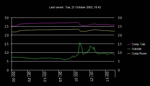
This is just a simple chart showing the current temperature in my computer room and outside. The graph image is updated hourly, but readings are taken once a minute and plotted every five minutes. You may see that every so often the computer room cabinet temperature starts to drop off rapidly. I've just attached an appliance module to the fans for the cabinet as an experiment, so now when the temperature rises above 27 degrees the fans come on, when it drops below 26 they turn off.
and a 24 hour rolling graph...

I have a small Visual Basic system tray application that I wrote to collect the temperature
readings. The application has a DCOM interface which means that other applications can access the
data too. I deliberately kept the charting and the actual gathering of the temperature readings separate simply because the data collection is more important than the graphing. Since all the data is logged I can still generate graphs for particular days or from a certain point in time (since monitoring began).The graph is generated once every 5 minutes but only uploaded once an hour, this is to keep my bandwidth usage low and besides it makes for a much more interesting graph to have a minimum of 12 plotted values. The data on the graph is reset automatically each night.
I've made a couple of changes since the original application. Instead of being logged to a file the data is logged to a MySQL database. When the graphing application is started it retrieves the data for the current day and then continues to plot at intervals of five minutes. I've also added the ftp code to the graphing application as there was occasionally a confict with saving and uploading the file resulting in corrupt images. Hopefully the integration will solve this problem. I've also added a rolling 24 hour graph and since my provider has increased my bandwidth allowance -
 - I've increased the update period to 15 minutes.
Moving the data to database means that graphs like the one below can be quickly and easily generated.The graph below ranges from the 24th December 2002 to 1st January 2003 with a plotted interval of 60 minutes.
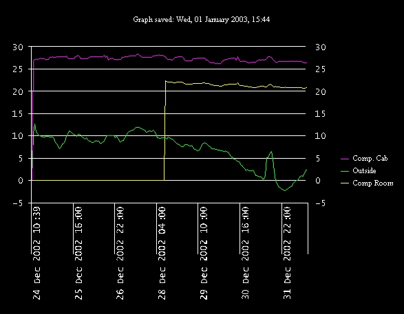
You may notice that the yellow plot line, representing the computer room appears to have been at 0 degrees from the 24th to the 28th. Obviously it wasn't, I just couldn't find one of my temperature probes.
Home
About
My Blog
Technology News
The Dream
The Tools
Wish List
Projects
Linux
Basic Stamp
Rabbit
Proximity Detection
Misc.
Contact
IRC
User groups
Links
Asterisk
Kiosk Test
[uiu]
About
My Blog
Technology News
The Dream
The Tools
Wish List
Projects
Linux
Basic Stamp
Rabbit
Proximity Detection
Misc.
Contact
IRC
User groups
Links
Asterisk
Kiosk Test
[uiu]